Haland learning INC building brand excellence
Haland Learning sought a digital presence that matched their expertise in workplace safety training. Design Henge crafted a seamless, modern website that elevates their brand and enhances user experience, reflecting the professionalism and trust they instill in their clients.

Logo & branding
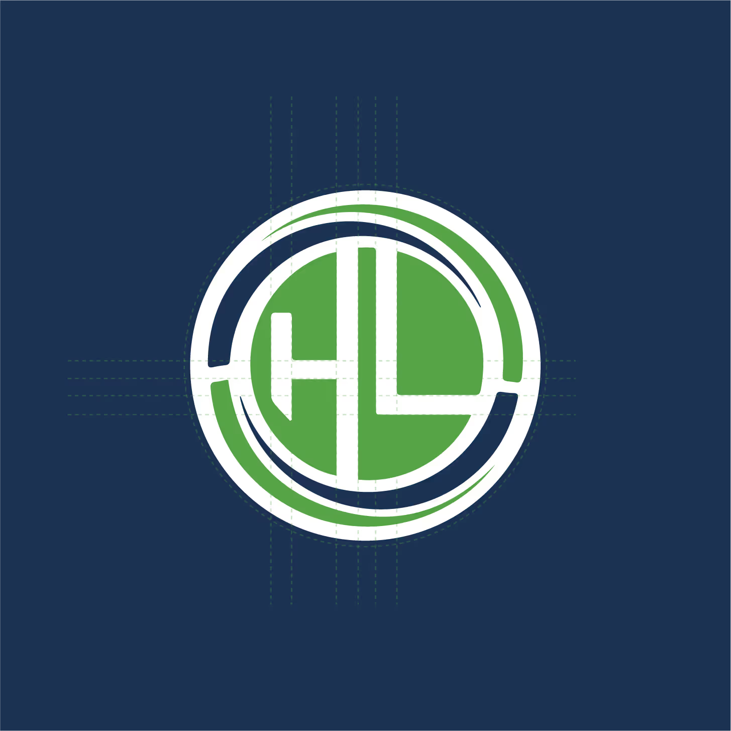
For Haland Learning, we created a logo and brand identity that reflect sophistication and trust. The design is sleek and minimalist, with precise lines that symbolize stability, expertise, and authority in workplace safety training.
Every element, from typography to color palette, was carefully selected to convey professionalism while maintaining approachability. The brand’s visual identity is a seamless blend of clarity and elegance, perfectly mirroring Haland Learning’s commitment to delivering safe, reliable, and effective training solutions. This refined branding establishes Haland Learning as an industry leader, evoking confidence and trust in every interaction.
- Mount Identity
- Brand Peak
- Logo Forge
- Visual Crest
- Iconic Mark
- Signature Edge
- Impact Frame
- Epic Imprint
- Signature Mark
- Bold Identity
- Creative Echo
- Vision Frame
Project Overview
Haland Learning tasked us with creating a sleek, responsive website that mirrors their commitment to high-quality safety training. Our goal was simple: deliver an intuitive platform with streamlined navigation and flawless functionality, allowing users to effortlessly access vital training resources.
The result is a modern, user-friendly site that perfectly aligns with Haland Learning’s efficiency and expertise, ensuring a seamless experience for all visitors.
Brief From The
Client
Haland Learning Inc needed a digital presence as impactful as the transformative learning experiences they provide. Their existing site lacked engagement, clarity, and the ability to connect with their audience effectively. They wanted a platform that highlighted their expertise, attracted top-tier clients, and positioned them as a leader in the education industry. The goal was clear—build a website that wasn’t just visually compelling but a strategic asset that drives growth and results.

The Challenge Our Client Was Facing
Despite being a leader in the education industry, Haland Learning Inc. struggled with a digital presence that didn’t reflect their impact. Their website lacked engagement, failed to communicate their expertise effectively, and wasn’t optimized to attract the right audience. They needed a solution to elevate their brand, establish authority in the industry, and turn visitors into long-term clients.


The idea:
We envisioned a sleek, intuitive platform that reflects Haland Learning’s commitment to safety. By optimizing design and functionality, we created a mobile-friendly experience where users can easily discover courses, register, and access resources—effortlessly aligning with Haland’s mission of efficiency and trust.
More than a symbol
Our design goes beyond aesthetics, it’s a tool that empowers visitors to find the training they need, instantly. Clean, simple navigation ensures visitors can quickly explore, book, and engage with Haland Learning’s offerings, building trust and supporting their mission of safety excellence.
The logo itself is more than just a visual mark; it symbolizes Haland Learning’s authority in the safety training industry. With its sleek design and bold simplicity, it represents the brand’s commitment to reliability and expertise, while conveying a sense of trust and professionalism at every touchpoint.
Brand identity & assets
The visual identity of the site speaks to professionalism, trust, and reliability. Our design choices are rooted in the values of safety and quality that Haland Learning embodies.
Font used in this project
Poppins & Montserrat are modern and clean fonts that ensure high legibility. Their design strikes a balance between professionalism and warmth, making them perfect for conveying both authority and approachability.

Color theme used in
this project
We choose a gentle, reassuring palette to convey a sense of calm and openness.
Midnight Blue
HEX #1b3252
RGB 27, 50, 82
Leaf Green
HEX #57A446
RGB 187, 164, 70
White
HEX #ffffff
RGB 255, 255, 255

Have an idea?
Let's collaborate!


Got a concept you’re passionate about? We’re here to bring it to life with creativity and precision. Collaborate with us and watch your vision transform into reality.
.png)
.png)
.png)
.png)

