Fresh, fun, and flawlessly branded
Yumme Gurl is clean, fresh, and effortlessly cool, it speaks to women who want effective beauty without the fluff. The brand needed a digital and packaging identity that felt as good as its products. They partnered with Design Henge to bring the Yumme Gurl aesthetic to life.

Modern packaging
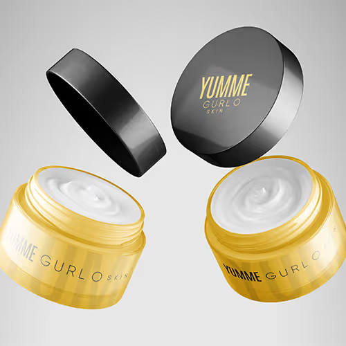
The packaging had to be clean but never boring, trendy yet timeless. Every detail—from color choices to typography—had to feel effortless, aligning with the brand’s fun, confident, and no-BS approach to skincare. We created sleek, high-impact packaging that stands out on the shelf and looks just as good on your bathroom counter.
The design needed to strike the perfect balance between minimalism and personality—something that feels premium but still approachable. Textures, finishes, and structural details were carefully selected to enhance the unboxing experience, making every product feel like a treat. The goal was to create packaging that not only protects the product but elevates the entire skincare ritual, reinforcing Yumme Gurl’s identity as a brand that’s as fun as it is effective.
- UI Magic
- Design Impact
- Packaging Art
- Brand Aesthetics
- UI Craft
- Packaging Innovation
- Visual Harmony
- Creative Wrap
- User Delight
- Impact Design
- Fluid Interaction
- Packaging Mastery
Project Overview
The old packaging didn’t match the brand’s energy. It lacked cohesion, personality, and that must-have appeal. Yumme Gurl needed a design refresh that was crisp, modern, and aligned with its identity as a playful yet premium beauty brand. We delivered a packaging and UI experience that balances sleek minimalism with a punch of personality.
Every element was designed with intention—from the bold yet refined color palette to the sleek, intuitive user interface. The new design ensures that every interaction with the brand, whether online or in person, feels cohesive and elevated. Yumme Gurl’s refresh wasn’t just about aesthetics; it was about creating a seamless brand experience that speaks to modern beauty lovers who appreciate both style and substance.
Brief From The
Client
Yumme Gurl wanted a design that felt bold, fresh, and instantly recognizable. The goal was to create a brand identity that reflected their clean beauty ethos while keeping things fun and aspirational. The challenge was blending a high-end aesthetic with a youthful, energetic feel—making it luxe but still approachable.

The Challenge Our Client Was Facing
The brand needed a design system that felt elevated but never stiff. The previous branding lacked personality and didn’t fully capture Yumme Gurl’s confidence and playfulness. It needed to stand out in the crowded beauty space, cut through the noise, and make an instant impression on modern consumers who appreciate both aesthetics and quality.


More than a logo — A whole vibe
Design Henge created a branding experience that speaks directly to Yumme Gurl’s audience. The visuals are sleek, the typography is modern, and the colors are bold but refined. Every design element is crafted to evoke trust, excitement, and that irresistible “I need this” reaction.
Beyond just looking good, the branding had to feel personal—like something effortlessly cool, aspirational yet relatable. The design carries an energy that aligns with the Yumme Gurl lifestyle: fresh, confident, and unapologetically bold. Every touchpoint, from packaging to digital assets, was fine-tuned to create an emotional connection, ensuring that when customers see Yumme Gurl, they don’t just recognize it they feel it.
Brand identity & assets
The branding is simple yet impactful, with strong, refined typography and high-contrast visuals. The minimalist approach keeps the focus on the product while the brand’s signature color palette adds personality.
Font used in this project
The typography is clean, confident, and effortlessly cool—just like the brand. It’s designed for clarity and impact, making the brand instantly recognizable.
.avif)
Color theme used in
this project
Sunflower Yellow (#FFCA36) is bold, bright, and full of energy. It reflects the vibrancy of the brand and its playful yet powerful identity.
Charcoal Black (#231F20) adds depth and sophistication, creating a sleek, modern contrast that keeps the brand looking premium.
Sunflower Yellow
HEX #FFCA36
RGB 255, 202, 54
Charcoal Black
HEX #231F20
RGB 35, 31, 32

Have an idea?
Let's collaborate!


Got a concept you’re passionate about? We’re here to bring it to life with creativity and precision. Collaborate with us and watch your vision transform into reality.
.png)
.png)
.png)
.png)


